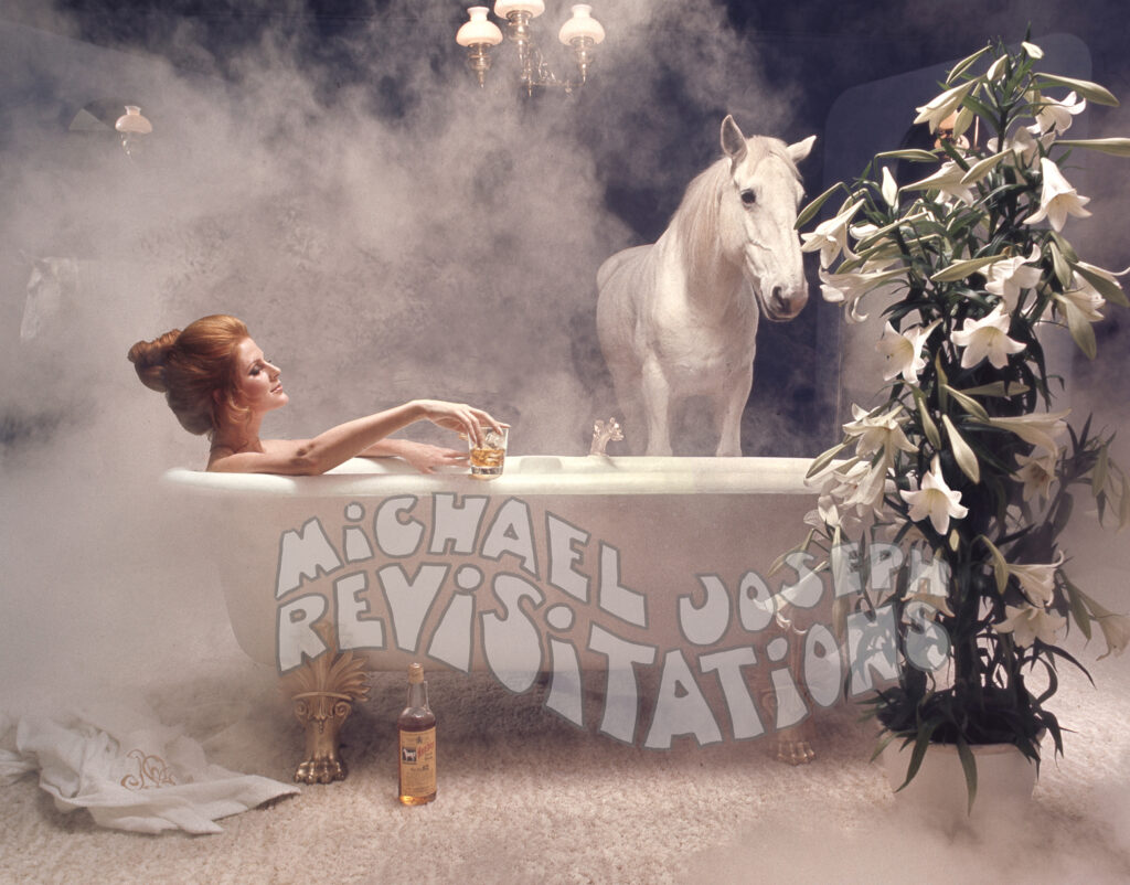
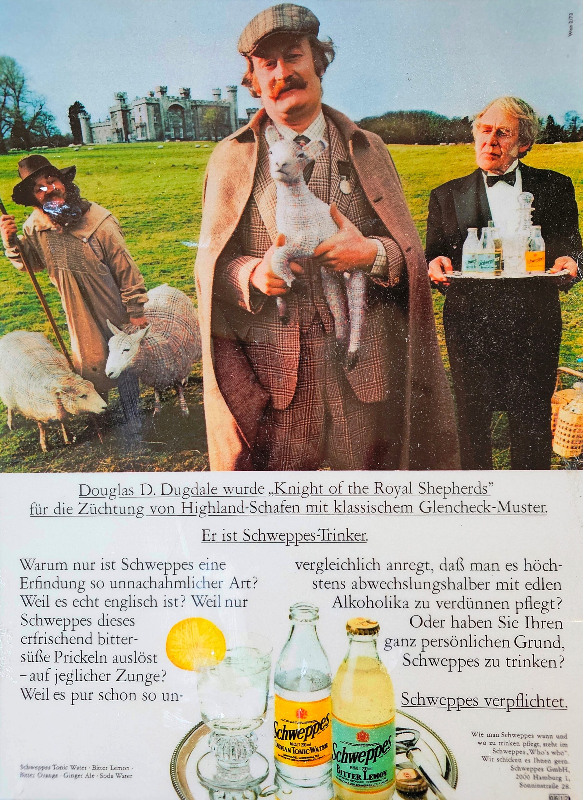
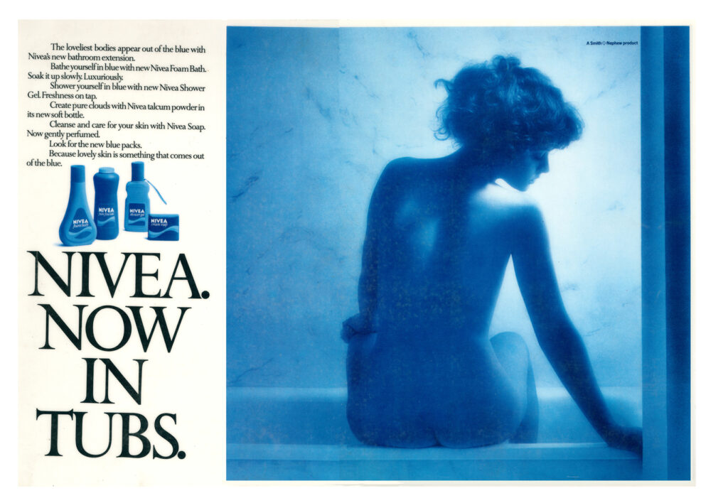
Of course, the Nivea colour is blue – below is a copy of the original advertisement that appeared in the UK in the mid-eighties.
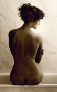
In the olden days, Nivea was in tubs – so the art director, Paul Arden, thought the catchphrase « Nivea now in tubs » was such a great opportunity – the girl sits on the edge of a bath tub, and the beauty of the image no doubt seduced more than one person into purchasing the new Nivea cream in tubs…
The Man Ray Violon d’Ingres reference ?
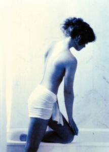
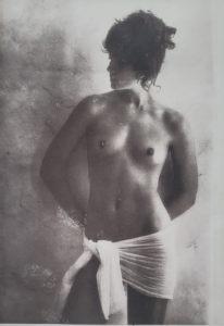
Despite what some might assume, the choice to capture a rearward composition in this instance was not a deliberate nod to Man Ray’s Violon d’Ingres, but rather a pragmatic decision dictated by the model’s physique. Whit a keen eye for aesthetics, Michael Joseph recognized that the front-facing perspective would draw undue attention to the model’s knobbly knees an element that, while entirely natural, might disrupt the fluid elegance of the scene. Instead, the chosen angle allowed for a seamless interplay of from and light, emphasizing the soft contours of the back, the sculptural poise of the pose, and the quiet intimacy that became signature of Nivea Now in Tubs